
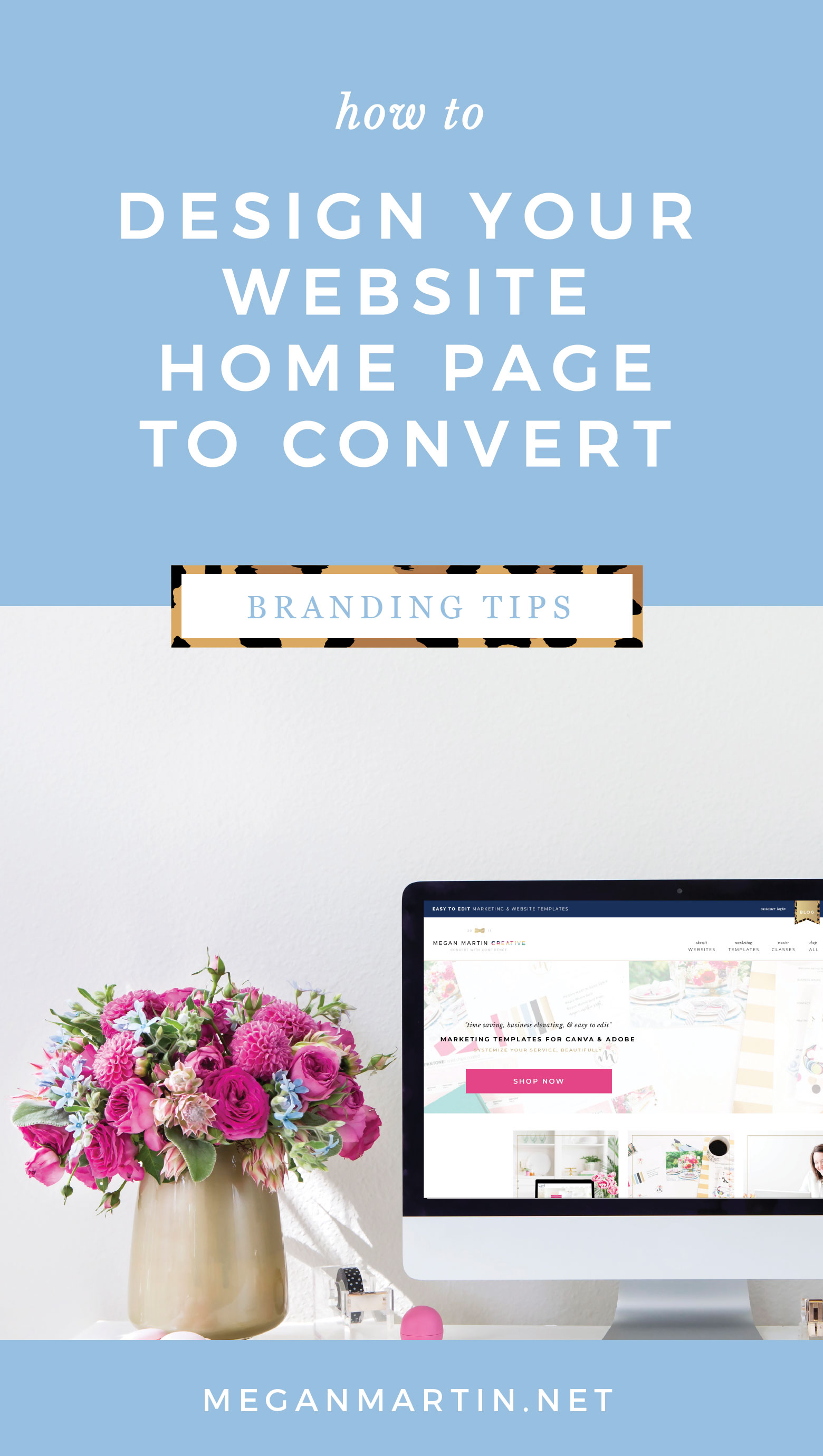
Website School is in session! Time to pull out our Kate Spade school supplies and get a degree in the science of Websites the Convert. The diploma will be pink. And scented. Adds a nice touch, don’t you think?! 😉 Today, we’re starting with the big kahuna: Your Website Home Page. And how to design it in a way that is irresistible for your ideal customers to want to pull up a chair and stay awhile so it can lead them to the sale!
When most people go to design a website, they focus on what the site will look like. Should your website be beautiful and visually attract your ideal customer? Of course. But in true Elle Woods form, I want your website to be smart a whip. I want your website to be both beautiful and built to convert. Because a website like that can make the sale for you. A website like that can mean the difference of you just being another tick on your ideal customer’s shop around list vs. having potential clients practically falling over themselves to get a chance to work with you.
So we are going to focus on what elements your website needs to convert. The possibilities are still endless for how to dress it up once the foundation is laid, but by focusing on building your website for conversion (or tweaking the one you already have!), you’ll end up with a home on the web that confidently books your dreamies into actual paying customers.
Prep School
If you’re new around here, welcome friend! There are a couple prep articles I want you to look over before you jump into your home page. These will help you establish a firm foundation for your website as a whole!
- Read this article from Communications Expert, Lauren Carnes, on defining the main goal for your website. This is a crucial first step to a website that converts on purpose!
- Then read this article. Especially if you have a fear of selling or feel unsure on how to talk about your offerings without sounding “sales-y.” We’re going to kick that fear to the curb here and now!
Pencils out, girl! Let’s begin!
Your Website Home Page is the Start of the Conversation
Home pages come in all shapes and sizes and there are about 1 billion different options for how to make it just right for you, but since we are focusing on a website that converts, there are a few important concepts and elements that I don’t want you to skip.
One of the biggest mistakes you can make on your home page is to just throw stuff up there just because there is room for it. If you read the first Prep School article (if not, seriously, go read it!) you should have a good grasp on the main goal of your website. Your home page is the first step in leading your potential customer to taking action to ultimately achieve that goal.
And if you read the second prep school article, you know that you’ve got 5 seconds once someone lands on your website to convince them to stay with your What and Who Statement and a clear Call to Action first thing above the fold.
But what next?
What if you are a multi-passionate creative and have different offers on the table? How do you organize them in a way that doesn’t overwhelm potential customers?
With so many options out there for how to set up your home page, how can you know what the right and wrong ways are?
Let’s dive in! (Picture me with a big grin on my face because I love this stuff!)
Picture this:
You’re out at a local art museum’s Professionals Night Out event. It is a casual early evening with a few of your gals and you’re enjoying a glass of wine. You’re introduced to your friend’s acquaintance and after swapping names and shaking hands, she sparks a conversation with you that goes something like…
“So what do you do?” she asks.
Enter Home Page.
I want you to think about your website like a journey through this off the cuff conversation. A casual and natural progression from the first hello to finding out what it is that you do and as the interest of your potential customer peaks after digging into each intentional page, you confidently pass over your business card at the end for her to call you (aka complete the last step whether that be fill out an inquiry form or complete a checkout process!).
One of the biggest struggles I hear from creatives when it comes to writing for your website, blog, and social captions is that they don’t want to come off sales-y. Nobody wants to be the pushy cars salesman.
I get you.
That’s why I like thinking about your website as a real encounter like the picture above. You don’t even know if she is your potential customer yet, right? She is just a gal who landed on your website and is interested in getting to know you.
If you were a cheesy car salesman, you’d see the opportunity to jump straight into a sales pitch and push your offering on her whether or not she was an ideal customer.
But that’s not you. 😉
Naturally, you wouldn’t pitch her right away. You’d give her a glimpse into what you do and follow her cues as the conversation continues and her interest level rises.
It might go on a little like…
“I’m a photographer!” You reply.
[She lands on your home page and takes in what’s above the fold]
“Oh, that’s so cool! What kind of photography do you do?”
[She reads your “Who and What Statement”]
“Well, I mostly capture weddings, but also shoot family and newborn portraits.”
[She looks at the pretty images on your home page and is drawn to your natural light aesthetic]…
It is here that many home pages fall flat.
The goal of your website home page is to facilitate the conversation. To help move it forward. We don’t want to be pushy, but rather follow her cues.
If you were chatting in person with her, you’d be able to easily determine if she wants to know more. She’d tell you. Her body language would give you the clue.
But since we are talking about websites, we have to give her an opportunity to give that cue.
That is what a Call To Action is all about. Giving your potential customer the next step in the journey to eventually lead to the sale.
If your home page just shows a pretty image or two and doesn’t point her to the next logical step of the journey to learn more, then we need to make some changes.
And conversely, if your website home page offers too many options that leaves her completely confused and unsure of where to go next, we need to hone it in.
Why That Main Goal Matters
This is why establishing a main goal for your website is crucial to the whole puzzle. If you just throw stuff up on the home page modeled after what so and so did and hope for the best, you probably won’t get much traction. Because there isn’t anything measurable to get traction on!
Here’s the thing: The more specific you can get with your main goal, the better. Especially if you have multiple offerings or products available.
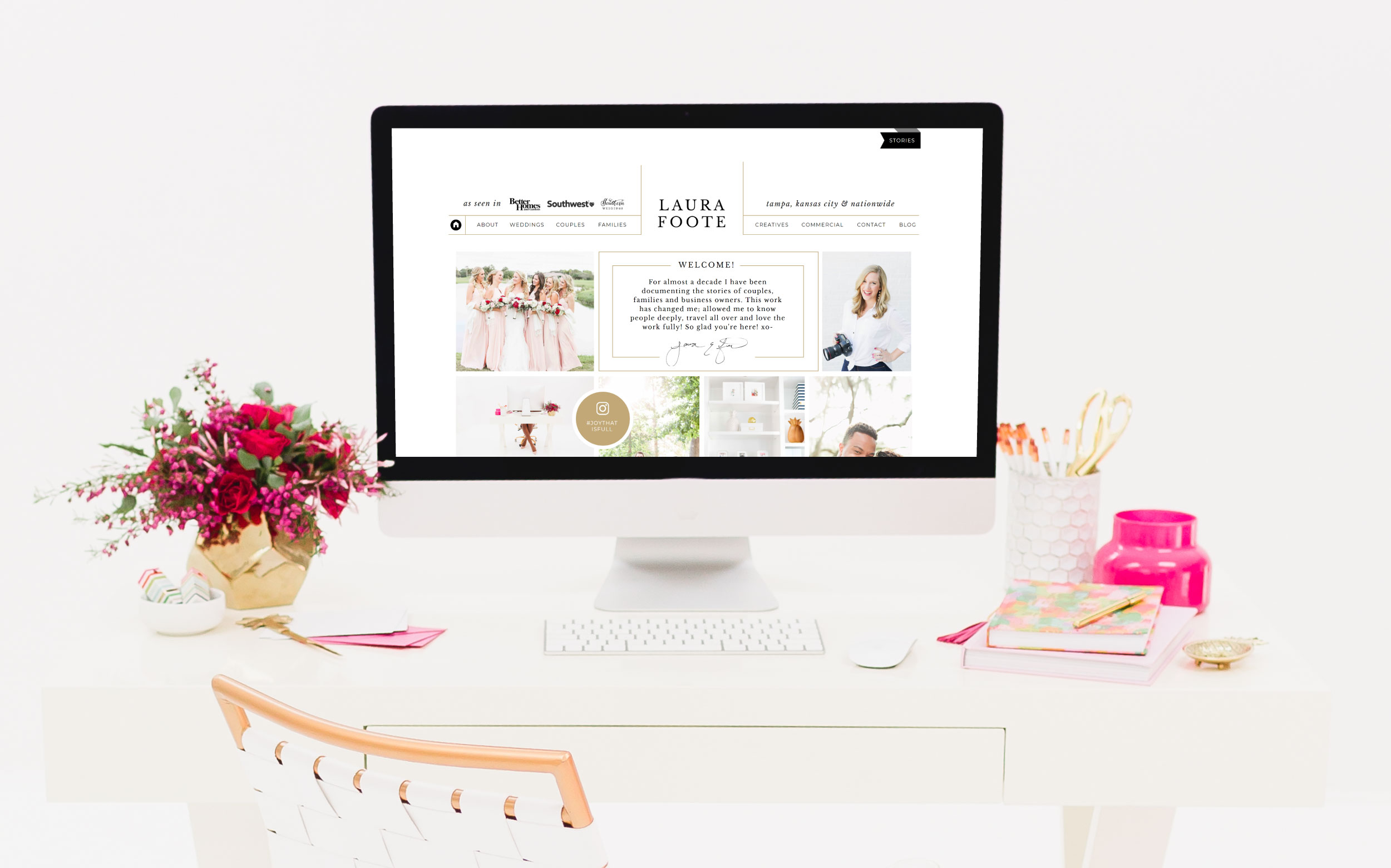
It is extremely difficult to push every offering you have at one time cohesively on one website home page. There are a few people who have mastered this well, but that feat goes beyond just how their home pages are laid out. It has to do with their brand messaging and foundational business elements like pricing, systems, marketing initiatives, and etc. My website design client, Laura Foote, is a good example.
I’ve had multiple photographers who aren’t interested in focusing on one specific niche client offering come to my door because of her website. Laura’s website works because the core of her brand messaging, her pricing structure, her systems, and her overall marketing strategy work cohesively together in a way that makes perfect sense for her home page to be designed in a way that beautifully illustrates all the different stories she captures.
I don’t suggest you try to imitate this direction just yet! Laura has been in business for almost a decade and has had a whole lot of time and experience and coaching along her journey that points to what you see now.
The BEST thing you can do as you get started with tweaking your website to actually convert is to start with a main goal. It doesn’t mean that has to be your main goal forever or that you have to only do ONE thing in your business, but if you really want to see growth in your business, focusing in on a main goal is the ticket.
In our “Picture This” example, our photographer mainly focuses on weddings and does some family and newborn portrait work, so let’s see how that would play out!
Laying out your website home page for conversion
When it comes to laying it all out, I want you to think about your home page like a stage. Your main goal is in the spotlight.
It is what the above the fold section highlights, the big hero image shows, or the slider on the home page conveys.
For our photographer example, she might choose to have a large slider above the fold. I’d tell her to highlight a wedding image first AND have the majority of the images be wedding focused. I’d also suggest she overlay her Who and What Statement and a call to action for your potential customers who want to get straight to the point either right on the slider or just underneath it so it is prominent.
That essentially answers the “So what do you do?” question in the first 5 seconds.
The rest of your home page layout is like the next 3 minutes of the conversation.
Idea to include: You might give a little glimpse of how you got into photography (a “Welcome Section!” with a short bio and another Call to Action to the “About Page” if she wants you to expound further into that!).
Idea to include: You might pull your phone out and show a couple of your recent favorite shots from sessions to show her how your natural light aesthetic comes out across weddings, families, and newborns (A “What are you looking for type section” that let’s her choose what she is interested in.).
Idea to include: If she is enjoying peeking at your work, you might pull up that recent Style Me Pretty feature you’re so proud of (think an “As Seen In” or “Testimonials” section!)
She might say, “Interestingly enough, I just got engaged a couple weeks ago! I love your style! Can you tell me a little bit about your packages?”
Idea to include: Of course she could scroll back up to your navigation bar and find a link to your services page, but that’s sort of akin to answering “So what do you do?” with “I’m a photographer,” handing over your business card with a pretty image on it and your website address, and then walking away without saying another word while crossing your fingers that she’ll pull out her phone and type in your website address to learn more.
No matter what details you end up including on your home page, I want you to wrap it up with a Call to Action that leads to the next logical step in the journey to achieving your main goal.
Open and close the home page with your main goal in the spotlight.
The Trouble With Formulas
There is no perfect formula for what you should include on your home page, but there is one important rule to keep in mind: Everything that you do include needs to be there on purpose.
Well, duh.
Hear me out.
We do not want to overwhelm our potential customer. The more places and spaces you call your potential customer to action, the more chances there are for overwhelm and decision fatigue.
This is the trouble with formulas and looking at industry peer websites for what to include on your home page.
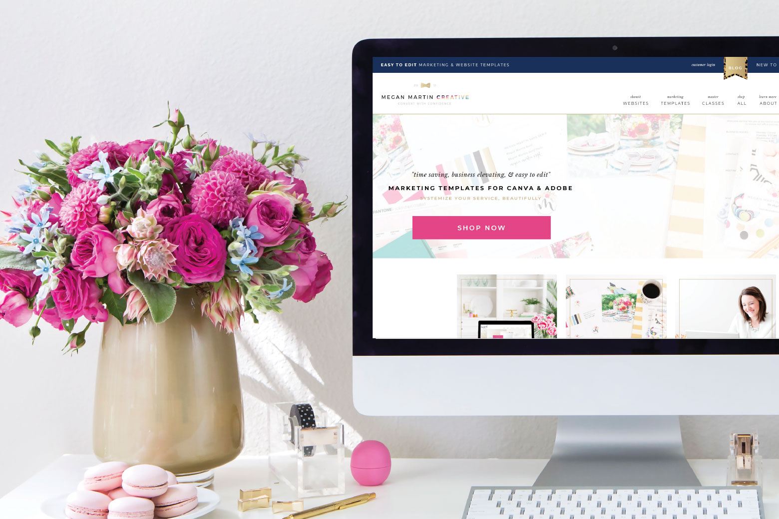
If you look at mine, you’ll see quite a lot of elements. Like Laura, I’ve been in business a long time and have become known for quite a few different facets of my business over the years. And what you don’t see is how my home page has evolved over that time throughout the different seasons of my business as the main goal has shifted.
In August of 2017, my number one main goal at the time was to build up my email marketing list. Right above the fold I had multiple calls to action leading to opt-in incentives to achieve that goal. As of now (August of 2018) my number one main goal is to scale my digital template shop sales. So you now see a homepage full of content that acts as different visual touch points to bring attention to my line of products.
Related: Why I Switched to Showit 5
The Truth of The Matter
What you also don’t see is that I’m always testing and tweaking my home page based on how people behave on it. I use a free tool called heatmap.me to give me valuable insight into where people are clicking on my website. This clues me into what sections of my home page are compelling visitors to explore further and which ones are just being scrolled past. Overtime, I’ll rearrange the home page order to put the most compelling content closer to the top of the page and rework or remove sections that aren’t performing well.
The truth of the matter is that your home page (and your website as a whole) is not a one and done thing. When you’re just starting out in business or even if you’ve been in biz awhile and you’re just starting a new website design, you can’t expect to build it once and then it perform perfectly for your ideal customer from now until the end of time. It takes understanding the concepts of websites that convert and a little testing and tweaking to really hone in on a well oiled machine of a internet home for your business.
But It doesn’t have to take you years to figure out.
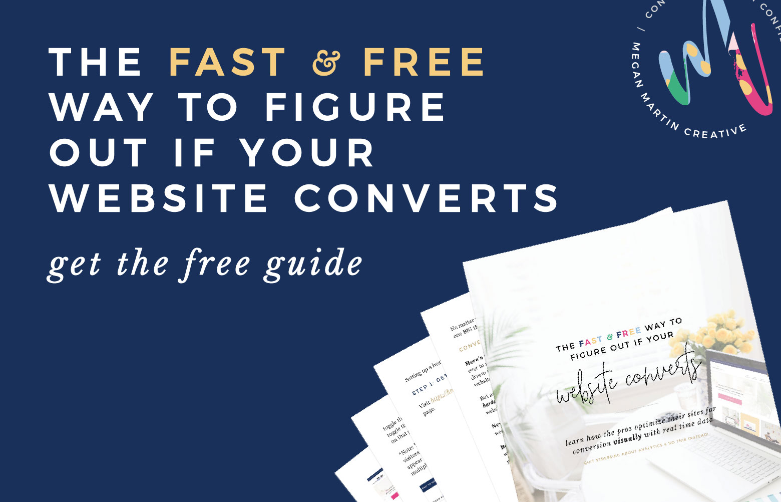
Curious to know if your website actually converts? Download your free copy of The Fast & Free Way to Figure Out if Your Website Converts to learn how to use the same free tool the pros use to visually see what on their website converts and what needs to be tweaked in real time (Hint: This is NOT about Google Analytics!).

[…] Image via Megan Martin Creative […]