
")


When it comes to deciding what website platform or template to use to create your site, it is important to think about how your website will translate into a mobile experience. With digital media consumption time on mobile tipping the scales at 51% per TechJury, it is your job to make sure that your mobile website is set up to be an enjoyable and easy to navigate experience AND set up to convert. Guess what? One of the BEST features of the Showit website builder is the mobile design feature. Let’s dive into how to design your mobile site to convert with Showit!
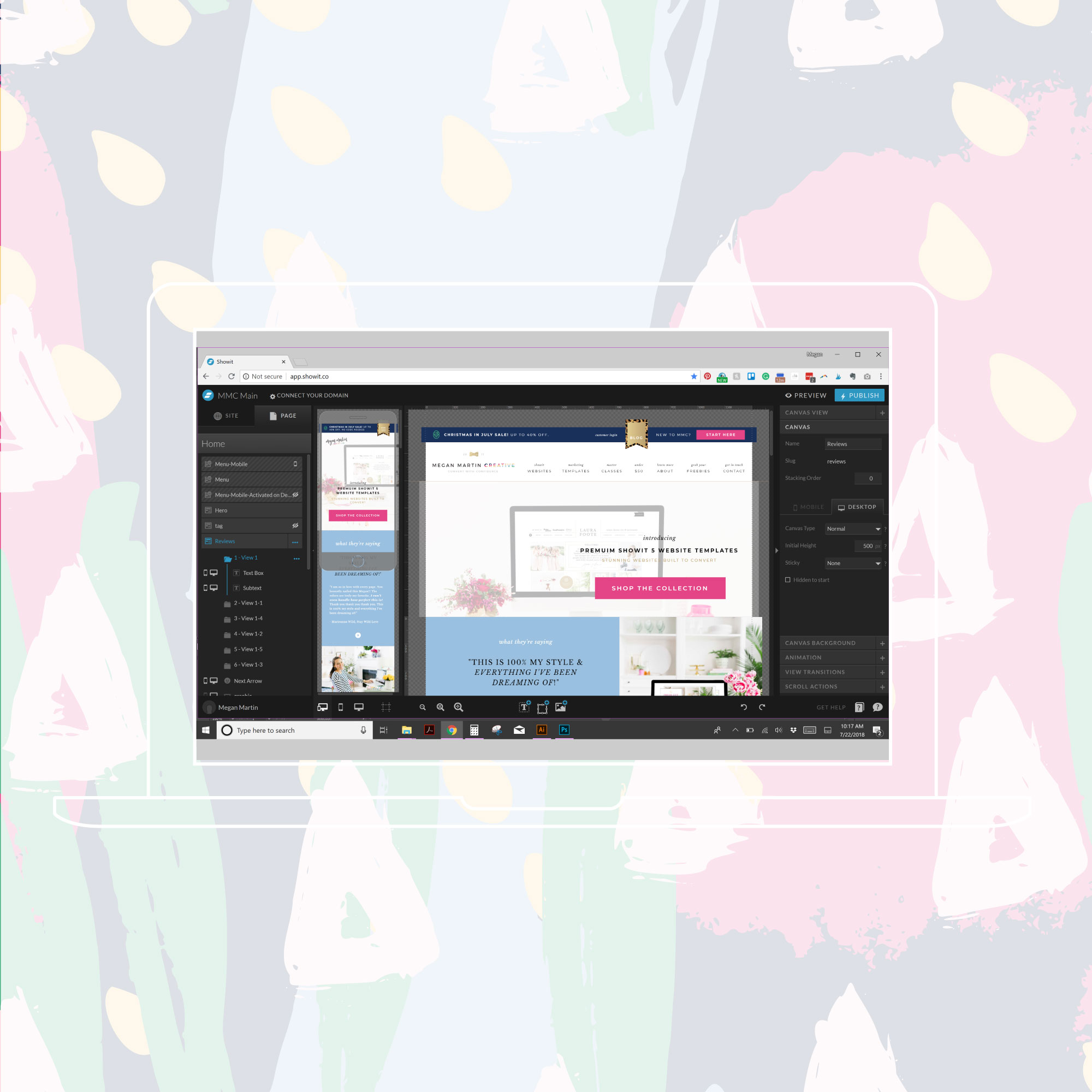
If you are a Showit user, you know that the drag and drop website editor has two major components, a mobile side and a desktop side… and the two don’t just automatically communicate with each other….
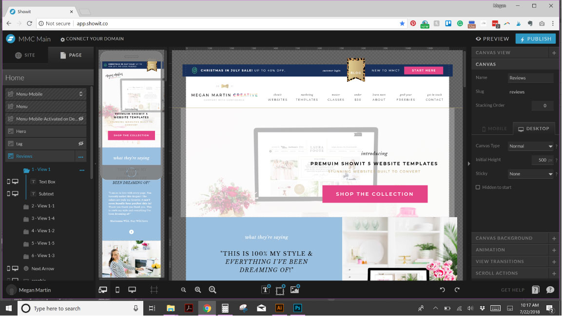
Not a Showiteer? Let me explain.
When you use other WordPress website templates or other website platforms like Shopify, Squarespace, and etc, whatever happens on the desktop side is typically automatically built and arranged on the mobile side.
Convenient, right?
Well, sometimes convenience is NOT best for you.
Convenience makes DIY website design tidy and faster, but typically leaves out the more important factor of any website that is for business: conversion. You know… how you actually make a living?
Just because you build a pretty website does not mean you will make money.
And you know I love me a pretty website. Give me all the colorful and fun details, please!
But pretty is a dime a dozen. Pretty is easy to make and EVERYWHERE. Don’t kid yourself. Your pretty website isn’t enough anymore to make you stand out from the 356 other competitors vying for your customer’s attention.
Your pretty website needs to convert.
And that takes getting strategic about the design and copy of your website.
So what does this have to do with a mobile-optimized site?
Well, everything.
People use the internet vastly different on a mobile device than how they explore the world wide web on their desktop.
So you could choose convenience and get a mobile website up and running FAST, or you could get smart and tap into Showit’s magical mobile creator where you have 100% control over every element, every word, and every canvas to create a unique mobile scrolling experience that isn’t tied to what you create on the desktop side.
More work and time to create the darn thing? Yes.
Worth it?
You tell me.
Do you want to capitalize on the worldwide increase in mobile internet usage and sell more?
🙋
Press play and dig into why Showit’s split desktop vs. mobile design builder allows you to have the full creative freedom to design each experience to be enjoyable, easy to navigate, and strategically built to convert.
You don’t even have to look at one single line of code to make it happen.
Click. Swap. Drag. Drop. It really is THAT easy.
How to Design Your Mobile Site to Convert with Showit
Cool right?
If you wanna tap into Showit’s magical mobile builder with a dash of convenience for a website that is both pretty and built to convert, I’ve got a suite of easy to edit website templates right this way!
Conversion + Convenience at your fingertips? Now that’s a savvy business owner. 😉
Links mentioned in the video:
57 Mobile vs. Desktop Usage Statistics For 2020 [Mobile’s Overtaking!] – Read up for yourself on the data from TechJury
Explore the exclusive Premium Showit Website Templates built to convert!


Genius! Thanks again for this actionable info Megan!